Data helps. Even when it is incomplete, it is more useful than emotionally manipulative reporting that often omits facts in favor of whatever is likely to get the most eyes.
But how can you tell when there are holes in the data? Ask questions.
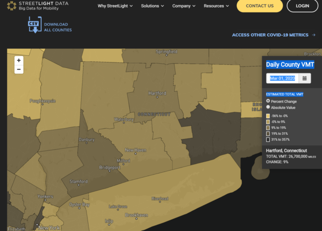
StreetLight used January 2019 as its baseline to study vehicle miles traveled (VMT).
By the beginning of March, some Connecticut residents were already reducing their VMT, yet other locations saw an increase in VMT.
Does using a county system tell us what we need to know? I want to see a more detailed breakdown, especially for areas outside of Fairfield County. Look at New London County (that’s the darkest area on the map above). Compare that to Windham County, directly above it. How different would this map look if we examined changes by town, rather than county? Which towns in eastern Connecticut have the greatest number of residents commuting to Rhode Island for work?
By the middle of last month, all counties saw a decline in VMT.
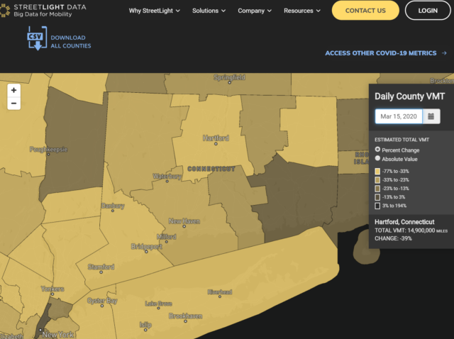
What we don’t know from this is where people were traveling to or what they were doing when they got there, if there was a there. It’s unknown exactly how this estimate is based on, but by this date gas prices began dropping and panic shopping had begun.
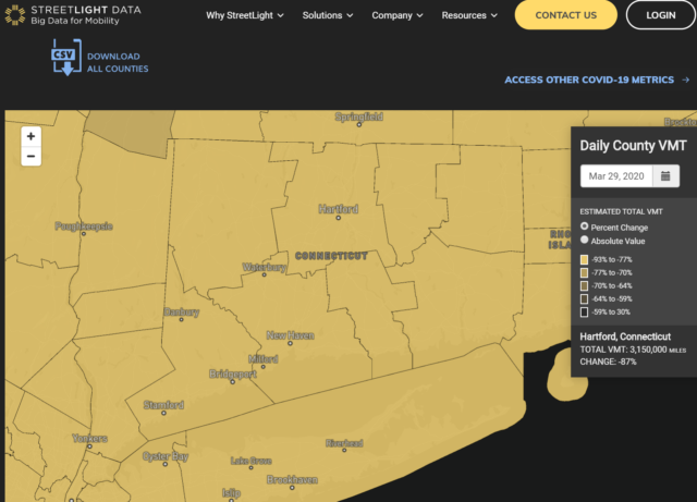
By the end of March, travel was significantly reduced in all counties — 77 to 93% fewer VMT from the baseline.
This does not tell us how many people are traveling in a vehicle or if in the absence of going to the mall or movies, people are just wasting the ever-less-expensive gas while joyriding.
This also does not tell us anything before March 1, 2020. Had rates been generally dropping? Were there fluctuations that would have been in line with what we saw during the first week of March?
What we see in Connecticut is not what is happening everywhere. The reduction of VMT in more rural areas is not as significant. There are Covid cases in every state.
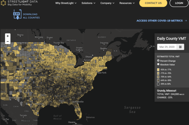
What does this mean? Overall, there has been a decrease in VMT, but it tells us nothing about the movement of people — just cars. We do not know from this if there have been fewer crashes. It does not say if this decrease in VMT has also led to a decrease in people being hospitalized or killed because of motor vehicle crashes. At a time when medical professionals and equipment are spread thin, you would hope people would be extra careful so as not to require those resources.
If we want to learn more about movement that is not restricted to automobiles, where do we turn?
Google.
Our phones are tracking us. That is fact, not paranoia.
Google is compiling Community Mobility Reports from devices that have the “Location History” setting enabled. Wherever that phone, tablet, laptop, or other device goes, regardless of if it is in a car or by skateboard, data is provided.
Using that, this is how Connecticut has been doing:
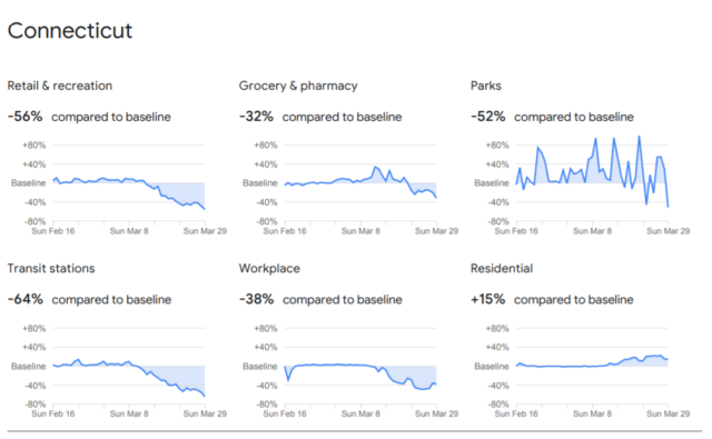
Compare that with the overall numbers for the United States: -47% for retail and recreation, -22% for grocery and pharmacy, -19% for parks, -51% for transit stations, -38% for workplaces, and +12% for residential.
What’s more telling is how movement in the United States compares to other places. Italy is seeing a 94% reduction in retail and recreation-related movement. South Korea reports that its retail and rec-related travel is -19%.
This data does not tell us how many people are in any given place at a time, nor what kind of physical distance they establish when there. Are there 50 people spread out in one store, practicing good hygiene? You can enter a grocery store that contains only one other person shopping, but if that person is infected and creeps up on you when you are reaching for the potatoes, you are still potentially in danger. The data does not tell us how people are behaving, other than that they have curtailed it.
Google data can also be deceptive because enough people know there is an option to turn location settings off. The norm may be for phones to go wherever people go, but some may leave their devices behind, maybe more so these days to disconnect from the never-ending stream of bad news.
What about the daily data released by the State of Connecticut? Let’s look at some of what was updated on April 6, 2020. (You can see the daily Test Data reports here)
This graph shows total number of people tested for Covid, and how many of those results were negative vs. positive. A false negative result is possible, and the CDC warns people who have symptoms aligned with Covid to act is if they had tested positive.
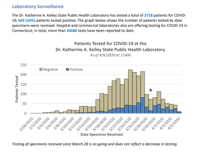
This also does not tell us anything about the number of people who are experiencing mild cases and have opted to not request tests, or who have not been able to get tested.
The following charts show why looking at data instead of sensational news coverage helps to maintain perspective. If you’ve had the misfortune of looking at some local news sites this week, you’ll see that they have played up a newborn infection and a previous newborn death. By played up, I mean they put huge headlines that are designed to grab attention and instill fear. Later, one of those reports was corrected to explain that the newborn in Windsor Locks was not infected.
What data tells us is that all age groups are impacted. As with the understanding that not everyone gets tested, it makes sense to assume that those in the younger age brackets are experiencing, overall, less severe symptoms; therefore, less likely to get tested.
While death at any age is sad, what the data tells us is what common sense dictates for pretty much any virus: the older one is, the more deadly it is. There are exceptions to be sure, but fixating on those ignores the trend.
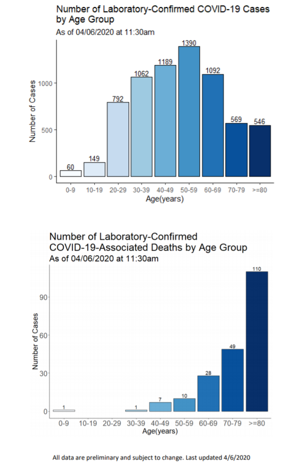
This might be a good time for the media to rethink their approach. What is gained by making new parents or soon-to-be parents overly worried? (That’s not to say this is not a pandemic or not serious, but good information can provoke people to act responsibly on behalf of others, whereas bad information can lead to excessive worry, which is not healthy)
Another thing I’ve noticed has been the frequent use of the county-only map showing where people have been hospitalized. That does not reflect where they live or where they may have contracted the virus. It might give us some idea of how cases have been distributed across the state, but without knowing how many hospital beds and ventilators are available in each facility of each county, this info is more useful to medical insiders than to the average person.
The town-by-town map is more enlightening. Without a doubt, Fairfield County is the most impacted, but even then, we can see which towns have clusters.
What most gets my attention about this, however, is that 264 cases are not reflected here because of address validation.
What does that mean?
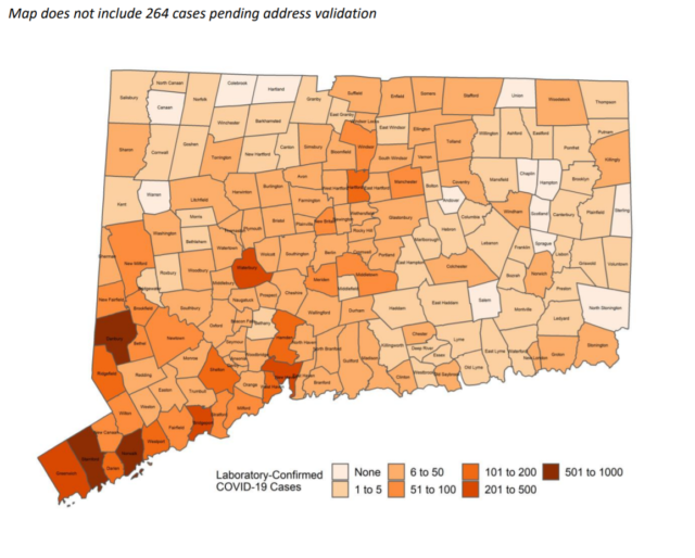
Still, that map gives a range that might be satisfying to some, not to all.
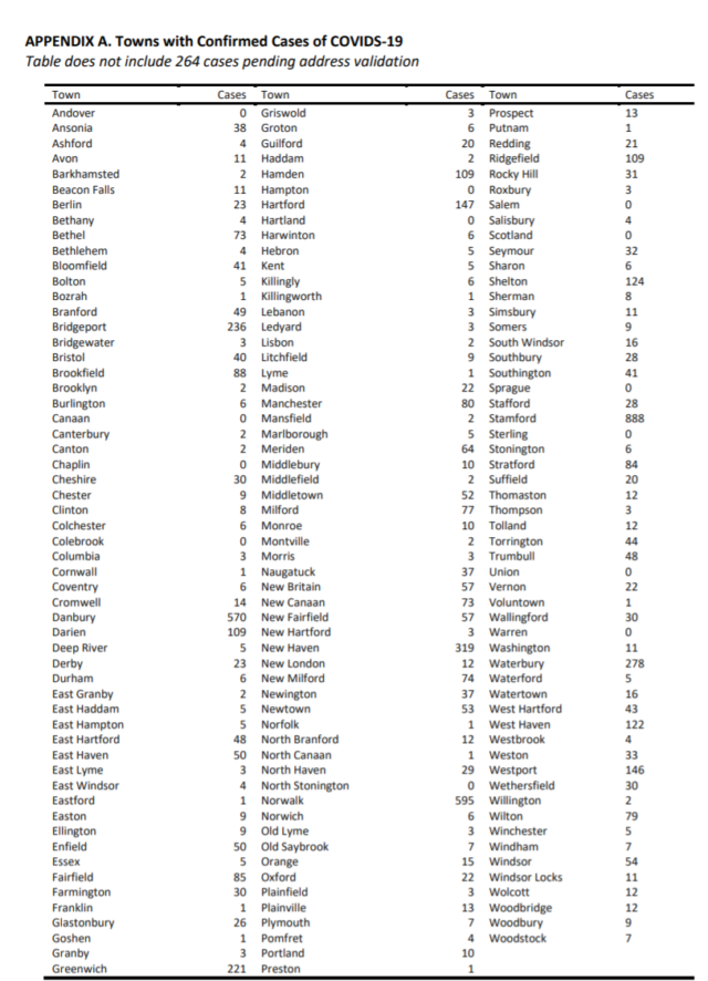
The table below might be more helpful. As of April 6, Stamford had 888 confirmed cases; compare that with Hartford’s 147.
Again, this is only the number of confirmed cases.
What we still do not know from this data is how many cases emerged from prisons/detention centers. We do not know from this how many were spread within nursing homes, though the daily updates tell us that 34% of nursing homes in Connecticut have had at least one Covid case. We do not know what the rate of infection has been like in homeless shelters. How many of these cases are spread among friends and family members, and how many from a trip to the supermarket? This data does not tell us that.
Data is always, to me, preferable to how the news packages it, but you have to ask the right questions about what it says and what it omits.
Featured image found in the State of Connecticut’s daily Test Data report from April 7, 2020.